1 Introduction
Matplotlib
库缺少中文字体,因此在图标上显示中文会出现乱码,解决办法:
1
2
3
4
5
6
7
8
from pyplt import mplmpl.rcParams['font.sans-serif' ] = ['SimHei' ] mpl.rcParams['axes.unicode_minus' ] = False import matplotlib.pyplot as pltplt.rcParams['font.sans-serif' ] = ['SimHei' ] plt.rcParams['axes.unicode_minus' ] = False
2 Steps
import module and set font style to avoid messy code
1
2
3
4
import matplotlib.pyplot as pltimport numpy as npplt.rcParams['font.sans-serif' ]=['SimHei' ] plt.rcParams['axes.unicode_minus' ]=False
step one: create figure and fix size (inch)
1 plt.figure(figsize = (12 , 8 ))
1
2
3
4
5
6
start_val = 0 stop_val = 10 num_val = 1000 x = np.linspace(start_val, stop_val, num_val) y = np.sin(x) plt.plot(x, y, '--g,' , lw = 2 , label = '$sin(x)$' )
step three: adjust axis and set label
1 2 3 4 5 6 7 8 9 10 11 12 13 14 15 16 17 x_min, y_max = 0 , 10 y_min, y_max = 0 , 1.5 plt.xlim(x_min, x_max) plt.ylim(y_min, y_max) plt.xlabel('x轴' , fontsize = 15 ) plt.ylabel('y轴' , fontsize = 15 ) x_location = np.arange(0 , 10 , 2 ) x_labels = ['2019-01-01' , '2019-02-01' , '2019-03-01' , '2019-04-01' , '2019-05-01' ] y_location = np.arange(-1 , 1.5 , 1 ) y_labels = [u'minimum' , u'zero' , u'maximum' ] plt.xticks(x_location, x_labels, rotation = 45 , fontsize = 15 ) plt.yticks(y_location, y_labels, fontsize = 15 )
step four: set grid and legend
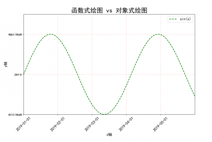
1 2 3 4 5 6 7 8 9 plt.grid(True , ls = ':' , color = 'r' , alpha = 0.5 ) plt.title('函数式绘图 vs 对象式绘图' , fontsize = 25 ) plt.legend(loc = 'upper right' , fontsize = 15 ) plt.show(
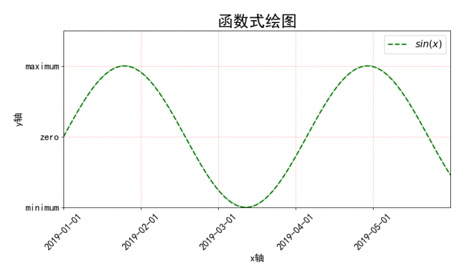
2.1 函数式绘图
1
2
3
4
5
6
7
8
9
10
11
12
13
14
15
16
17
18
19
20
21
22
23
24
25
26
27
28
29
30
31
32
33
34
35
36
37
38
39
40
41
42
import matplotlib.pyplot as pltimport numpy as npplt.rcParams['font.sans-serif' ] = ['SimHei' ] plt.rcParams['axes.unicode_minus' ] = False plt.figure(figsize = (12 , 6 )) start_val = 0 stop_val = 10 num_val = 1000 x = np.linspace(start_val, stop_val, num_val) y = np.sin(x) plt.plot(x, y, '--g,' , lw = 2 , label = '$sin(x)$' ) x_min = 0 x_max = 10 y_min = 0 y_max = 1.5 plt.xlim(x_min, x_max) plt.ylim(y_min, y_max) plt.xlabel('x轴' , fontsize = 15 ) plt.ylabel('y轴' , fontsize = 15 ) x_location = np.arange(0 , 10 , 2 ) x_labels = ['2019-01-01' , '2019-02-01' , '2019-03-01' , '2019-04-01' , '2019-05-01' ] y_location = np.arange(-1 , 1.5 , 1 ) y_labels = [u'minimum' , u'zero' , u'maximum' ] plt.xticks(x_location, x_labels, rotation = 45 , fontsize = 15 ) plt.yticks(y_location, y_labels, fontsize = 15 ) plt.grid(True , ls = ':' , color = 'r' , alpha = 0.5 ) plt.title('函数式绘图' , fontsize = 25 ) plt.legend(loc = 'upper right' , fontsize = 15 ) plt.show()
result:
fig 2-1 函数式绘图
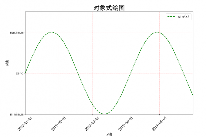
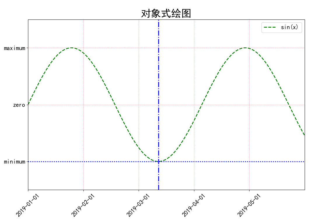
2.2 对象式绘图
1
2
3
4
5
6
7
8
9
10
11
12
13
14
15
16
17
18
19
20
21
22
23
24
25
26
27
28
29
30
31
32
33
34
35
36
37
38
39
40
41
42
43
44
import matplotlib.pyplot as plt import numpy as npplt.rcParams['font.sans-serif' ] = ['SimHei' ] plt.rcParams['axes.unicode_minus' ] = False fig = plt.figure(figsize = (12 , 8 )) ax = fig.add_subplot(111 ) start_val, stop_val, num_val = 0 , 10 , 1000 x = np.linspace(start_val, stop_val, num_val) y = np.sin(x) ax.plot(x, y, '--g' , lw = 2 , label = 'sin(x)' ) x_min, x_max = 0 , 10 y_min, y_max = 0 , 1.5 ax.set_xlim(x_min, x_max) ax.set_ylim(y_min, y_max) plt.xlabel('x轴' , fontsize = 15 ) plt.ylabel('y轴' , fontsize = 15 ) x_location = np.arange(0 , 10 , 2 ) x_labels = ['2019-01-01' , '2019-02-01' , '2019-03-01' , '2019-04-01' , '2019-05-01' ] y_location = np.arange(-1 , 1.5 , 1 ) y_labels = [u'minimum' , u'zero' , u'maximum' ] plt.xticks(x_location, x_labels, rotation = 45 , fontsize = 15 ) plt.yticks(y_location, y_labels, fontsize = 15 ) plt.grid(True , ls = ':' , color = 'r' , alpha = 0.5 ) plt.title('函数式绘图 vs 对象式绘图' , fontsize = 25 ) plt.legend(loc = 'upper right' , fontsize = 15 ) plt.show()
result:
fig 2-2 对象式绘图
3.1 Line attributes
plot() 函数中,可设置参数以调整线条的属性:
linestyle: 设定线条类型
color: 指定线条的颜色
marker: 指定线条的标记风格
linewidth: 设定线条的宽度
label: 设置线条的标签
1
2
3
4
5
6
7
8
9
10
import matplotlib.pyplot as pltimport numpy as npstart_val, stop_val, num_val = 0 , 10 , 1000 x = np.linspace(start_val, stop_val, num_val) y = np.sin(x) ax.plot(x, y, '--g' , lw = 2 , label = '$sin(x)$' )
3.2 标注点的绘制
当要在图形上给数据添加指向性注释文本时,可以使用 Matplotlib 的
annotate()
函数,支持箭头指示,方便在合适的位置添加描述信息。关键参数如下:
s:注释文本内容
xy:备注是的坐标点,二维元组格式 (x, y)
xytext:注释文本的坐标点,二维元组格式 (x, y)
xycoords:被注释点的坐标系属性,默认为 'data'
textcoords:设置注释文本的坐标系属性,默认与 xycoords
属性值相同,通常设置为 'offset points' or 'offset pixels',
即相对于被注释点 xy 的偏移量
arrowprops:设置箭头的样式,dict 格式
If 'arrowprops' does not contain the key ' arrowstyle', the allowed
keys are:
tab 5-1 arrowstyle key-1
width
The width of the arrow in points
headwidth
The width of the base of the arrow head in
points
headlength
The length of the arrow head in
points
shrink
Fraction of total length to shrink from
both ends
?
Any key to
matplotlib.patches.FancyArrowPatch
如果 arrowprops 包含了关键词 ' arrowstyle', the above keys are
forbidden. The allowed values of 'arrowstyle' are:
tab 5-2 arrowstyle key-2
'-'None
'->'head_length=0.4,head_width=0.2
'-['widthB=1.0,lengthB=0.2,angleB=None
'|-|'widthA=1.0,widthB=1.0
'-|>'head_length=0.4,head_width=0.2
'<-'head_length=0.4,head_width=0.2
'<->'head_length=0.4,head_width=0.2
'<|-'head_length=0.4,head_width=0.2
'<|-|>'head_length=0.4,head_width=0.2
'fancy'head_length=0.4,head_width=0.4,tail_width=0.4
'simple'head_length=0.5,head_width=0.5,tail_width=0.2
'wedge'tail_width=0.3,shrink_factor=0.5
Valid keys for ~matplotlib.patches.FancyArrowPatch
are:
tab 5-3 ~matplotlib.patches.FancyArrowPatch
arrowstyle
the arrow style
connectionstyle
the connection style
relpos
default is (0.5, 0.5)
patchA
default is bounding box of the text
patchB
default is None
shrinkA
default is 2 points
shrinkB
default is 2 points
mutation_scale
default is text size (in points)
mutation_aspect
default is 1
?
any key for matplotlib.patches.PathPatch
Case 1:
1 2 3 4 5 6 7 8 9 10 11 12 13 14 15 16 17 18 19 20 21 22 23 24 25 26 ax.annotate(u'The top point' , xy = (np.pi/2 , 1 ), xytext = (np.pi/2 , 1.3 ), weight = 'regular' , color = 'g' , fontsize = 15 , arrowprops = { 'arrowstyle' : '->' , 'connectionstyle' : 'arc3' , 'color' :'g' }) ax.annotate(u'The low point' , xy = (np.pi*3 /2 , -1 ), xytext = (np.pi*3 /2 , -1.3 ), weight = 'regular' , color = 'r' , fontsize = 15 , arrowprops = { 'arrowstyle' : '->' , 'connectionstyle' : 'arc3' , 'color' :'r' }) plt.show()
fig 3-1 Annotation case1
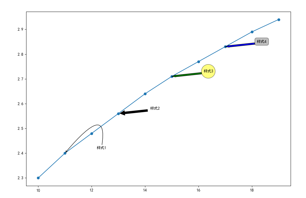
Case 2:绘制以下四种样式的标注点
注释文本 'annotate1' 所对应的样式配置:在 arrowprops
参数中使用关键字 'arrowstyle' 设置 箭头样式
'->',关键字 connectionstyle 设置连接线的样式
注释文本 'annotate2' 所对应的样式配置:在 arrowprops
参数中使用关键字 'arrowstyle' ,允许配置箭头的宽度 width、
箭头两端收缩的百分比 shrink 等
注释文本 'annotate3' 所对应的样式配置:使用 bbox
参数在文本周围添加外框,设置外框为 round 格式
注释文本 'annotate1' 所对应的样式配置:使用 bbox
参数在文本周围添加外框, 设置外框为 round 样式
1 2 3 4 5 6 7 8 9 10 11 12 13 14 15 16 17 18 19 20 21 22 23 24 25 26 27 28 29 import matplotlib.pyplot as pltimport numpy as npplt.rcParams['font.sans-serif' ] = ['SimHei' ] plt.rcParams['axes.unicode_minus' ] = False fig = plt.figure(figsize = (12 , 8 )) ax = fig.add_subplot(111 ) x = np.arange(10 , 20 ) y = np.around(np.log(x), 2 ) ax.plot(x, y, marker = 'o' ) ax.annotate(u'样式1' , xy = (x[1 ], y[1 ]), xytext = (80 , 10 ), textcoords = 'offset points' , arrowprops = dict (arrowstyle = '->' , connectionstyle = 'angle3, angleA = 80, angleB = 50' )) ax.annotate(u'样式2' , xy = (x[3 ], y[3 ]), xytext = (80 , 10 ), textcoords = 'offset points' , arrowprops = dict (facecolor = 'black' , shrink = 0.05 , width = 5 )) ax.annotate(u'样式3' , xy = (x[5 ], y[5 ]), xytext = (80 , 10 ), textcoords = 'offset points' , arrowprops = dict (facecolor = 'green' , headwidth = 5 , headlength = 10 ), bbox = dict (boxstyle = 'circle, pad = 0.5' , fc = 'yellow' , ec = 'k' , lw = 1 , alpha = 0.5 )) ax.annotate(u'样式4' , xy = (x[7 ], y[7 ]), xytext = (80 , 10 ), textcoords = 'offset points' , arrowprops = dict (facecolor = 'blue' , headwidth = 5 , headlength = 10 ), bbox = dict (boxstyle = 'round, pad = 0.5' , fc = 'gray' , ec = 'k' , lw = 1 , alpha = 0.5 )) plt.show()
result:
fig 3-2 annoatation case2
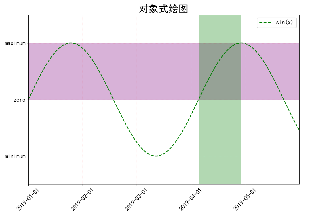
3.3 参考线/区域的绘制
使用 Matplotlib 的 axhline() 函数、axvline()
函数分别在图形中添加水平参考线和垂直参考线,使用 axhline() 函数时给定 y
轴上的位置,同理axvline() 使用时需要给定 x 轴上的位置
1 2 ax.axhline(y = min (y), c = 'blue' , ls = ':' , lw = 2 ) ax.axvline(x = np.pi*3 /2 , c = 'blue' , ls = '-.' , lw = 2 )
result:
fig 3-3 Reference line
使用 axhspan() 函数、axvspan() 函数分别在图形中添加 sin() 函数平行于
x 轴的参考区域和平行于 y 轴的参考区域,axhspan() 函数需给定 y
轴上的区间位置,同理在 axvspan() 中需给定 x 轴上的区间位置
1 2 ax.axhspan(ymin = 0 , ymax = 1 , facecolor = 'purple' , alpha = 0.3 ) ax.axvspan(xmin = np.pi *2 , xmax = np.pi * 5 /2 , facecolor = 'g' , alpha = 0.3 )
result:
fig 3-4 Reference interval
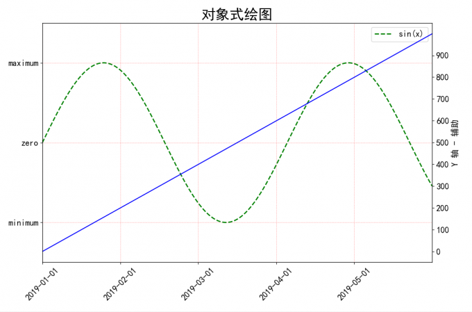
3.4 双 Y 轴图表的绘制
如果要在同一个 x 轴上显示两个不同数量级别的序列,
可以将第二个序列绘制在右侧辅助的 y 轴上,借助 Matplotlib 的 twinx() 和
twiny() 可以实现两个 y 或 x 轴
1 2 3 4 5 6 7 8 9 ax_aux = ax.twinx() ax_aux.plot(x, np.arange(1000 ), color = 'blue' , label = 'line 1000' ) y_location1 = np.arange(0 , 1000 , 100 ) y_labels1 = np.arange(0 , 1000 , 100 ) ax_aux.set_yticks(y_location1) ax_aux.set_yticklabels(y_labels1, fontsize= 15 ) ax_aux.set_ylabel('Y 轴 - 辅助' , fontsize= 15 )
result:
fig 3-5 双 Y 轴 图表
1 fig.legend(loc = 'upper right' , bbox_to_anchor = (1 , 1 ), bbox_transform = ax.transAxes, fontsize = 15 )
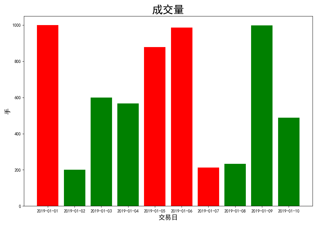
3.5 条形图的绘制
条形图时通过相同宽度条形的高度/宽度来表现数据差异的图表,可利用 bar()
函数绘制
1 2 3 4 5 6 7 8 9 10 11 12 13 14 15 16 17 18 19 20 21 22 23 24 25 26 27 28 29 30 31 32 33 34 import matplotlib.pyplot as pltimport numpy as npimport pandas as pdplt.rcParams['font.sans-serif' ] = ['SimHei' ] plt.rcParams['axes.unicode_minus' ] = False fig = plt.figure(figsize = (12 , 8 )) ax = fig.add_subplot(111 ) date_index = pd.date_range('2019-01-01' , freq = 'D' , periods = 10 ) y_location = np.arange(0 , 1000 , 200 ) y_labels = np.arange(0 , 1000 , 200 ) red_bar = [1000 , 0 , 0 , 0 , 879 , 986 , 213 , 0 , 0 , 0 ] green_bar = [0 , 200 , 599 , 567 , 0 , 0 , 0 , 234 , 998 , 489 ] ax.bar(date_index, red_bar, facecolor = 'red' ) ax.bar(date_index, green_bar, facecolor = 'green' ) ax.set_xlabel(u'交易日' , fontsize = 15 ) ax.set_ylabel(u'手' ,fontsize = 15 ) ax.set_title(u'成交量' , fontsize = 25 ) plt.show()
result:
fig 3-6 条形图
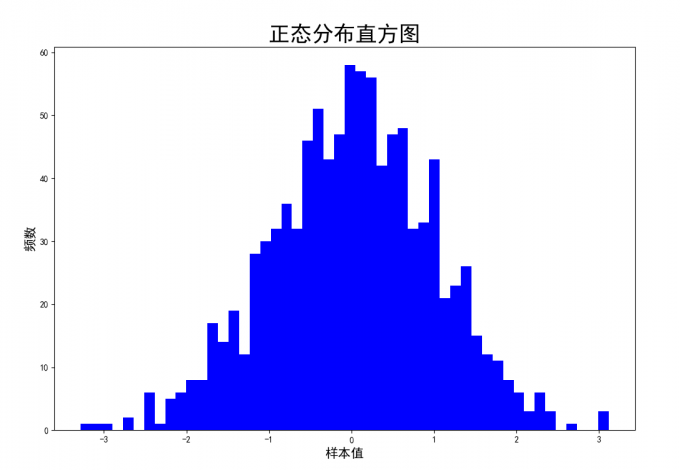
3.6 直方图
绘制直方图,首先要将全部样本数据按照不同的区间范围划分为若干组,每个组为直方图的柱子,柱子宽度表示该组的区间,柱子的高度表示数据出现的次数
x:绘制直方图的数据(一维数组形式),例如服从正态分布的随机数组
bins:直方图的柱数
desity:是否将直方图的频数(数据出现的次数)转换成频率(数据所占的比例)的表示,默认为
False,True表示显示频数统计结果
n:直方图中每一个 bar 区间数据的频数或频率, 由参数 density
设定
bins:用于返回各个 bin 的区间范围
patches:;列表形式返回每个 bin 的图形对象
1 2 3 4 5 6 7 8 9 10 11 12 13 14 15 16 17 18 import matplotlib.pyplot as pltimport numpy as npplt.rcParams['font.sans-serif' ] = ['SimHei' ] plt.rcParams['axes.unicode_minus' ] = False fig = plt.figure(figsize = (12 , 8 )) ax = fig.add_subplot(111 ) ax.hist(np.random.normal(loc = 0 , scale = 1 , size = 1000 ), bins = 50 , density = False , color = 'b' ) ax.set_xlabel(u'样本值' , fontsize = 15 ) ax.set_ylabel(u'频数' , fontsize = 15 ) ax.set_title(u'正态分布直方图' , fontsize = 25 ) plt.show()
result:
fig 3-7 直方图
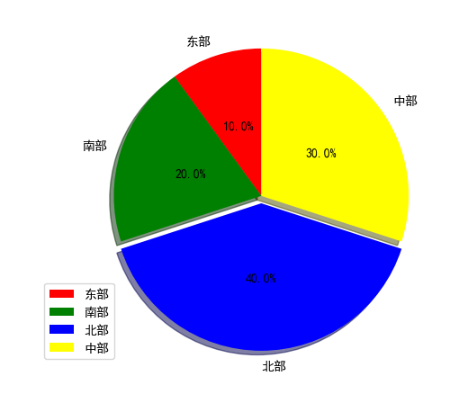
3.7 饼图
1 2 3 4 5 6 7 8 9 10 11 12 import matplotlib.pyplot as pltfrom pylab import *rcParams['font.sans-serif' ]=['SimHei' ] labels=["东部" ,"南部" ,"北部" ,"中部" ] sizes=[5 ,10 ,20 ,15 ] colors=["red" ,"green" ,"blue" ,"yellow" ] explode=(0 ,0 ,0.05 ,0 ) plt.pie(sizes, explode = explode, labels = labels, colors = colors, labeldistance = 1.1 ,autopct = "%3.1f%%" , shadow = True , startangle = 90 , pctdistance = 0.5 ) plt.axis("equal" ) plt.legend() plt.show()
result:
fig 3-8 饼图
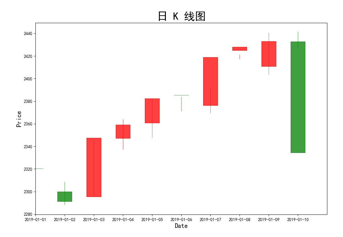
3.8 K 线图
candlestick_ochl(), candlestick2_ochl()
股票的 K 线记录着一个时间段的开盘价、最高价、最低价、收盘价这 4
个数据,定义如下:
1 2 import mpl_finance as mpfcandlestick2_ochl(ax, opens, closea, highs, lows, width = 4 , colorup = 'k' , colordown = 'r' , alpha = 0.75 )
ochl: opens, closes, highs, lows,
分别表示开盘价、收盘价、最高价、最低价的序列
1 2 3 4 5 6 7 8 9 10 11 12 13 14 15 16 17 18 19 20 21 22 23 24 25 26 27 28 29 30 31 32 33 34 35 36 import matplotlib.pyplot as pltimport mpl_finance as mpfimport numpy as npimport pandas as pdplt.rcParams['font.sans-serif' ] = ['SimHei' ] plt.rcParams['axes.unicode_minus' ] = False fig = plt.figure(figsize = (12 , 8 )) ax = fig.add_subplot(111 ) opens = [2320.36 , 2300 , 2295.35 , 2347.22 , 2360.75 , 2385.43 , 2376.41 , 2424.92 , 2411 , 2432.68 ] closes = [2320.26 , 2291.3 , 2347.5 , 2358.98 , 2382.48 , 2385.42 , 2419.02 , 2428.15 , 2433.13 , 2334.48 ] lows = [2287.3 , 2288.26 , 2295.35 , 2337.35 , 2347.89 , 2371.23 , 2369.57 , 2417.58 , 2403.3 , 2427.7 ] highs = [2362.94 , 2308.38 , 2345.92 , 2363.8 , 2382.48 , 2383.76 , 2391.82 , 2421.15 , 2440.38 , 2441.73 ] mpf.candlestick2_ochl(ax, opens, closes, highs, lows, width = 0.5 , colorup = 'r' , colordown = 'g' ) date_index = pd.date_range('2019-01-01' , freq = 'D' , periods = 10 ) ax.set_xlim(0 , 10 ) ax.set_xticks(np.arange(0 , 10 )) ax.set_xticklabels([date_index.strftime('%Y-%m-%d' )[index] for index in ax.get_xticks()]) ax.set_xlabel(u'Date' , fontsize = 15 ) ax.set_ylabel(u'Price' , fontsize = 15 ) ax.set_title(u'日 K 线图' , fontsize = 25 ) plt.show()
result:
fig 3-9 K 线图
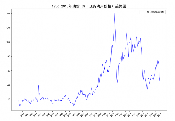
3.9 Time series
当横轴时间过长,不利于展示图片信息时,可以通过 matplotlib.datas
模块和ax.xaxis.set_major_formatter(mdates.DateFormatter('%Y'))来调整仅显示年份
1 2 3 4 5 6 7 8 9 10 11 12 13 14 15 16 17 18 19 20 21 22 23 24 25 26 27 28 29 30 31 32 33 import matplotlib.pyplot as pltimport matplotlib.dates as mdatesimport pandas as pdimport numpy as npplt.rcParams['font.sans-serif' ] = ['SimHei' ] plt.rcParams['axes.unicode_minus' ] = False data_ticks = pd.date_range(start = '1985-12' , freq = 'Y' , end = '2019-01' ) data_labels = np.arange(1985 , 2019 ) data = pd.read_csv(r'D:\Demo\University\XMU\Thesis\Master\WTI.csv' ) x_index = pd.date_range(start = '1986-01' , freq = 'M' , end = '2019-01' ) data1 = data.loc[:, '收盘' ] data_pt = data1.to_list() petrol_price = pd.DataFrame(data_pt, index = x_index, columns = ['Pt_price' ]) fig = plt.figure(figsize = (12 , 8 )) ax = fig.add_subplot(111 ) ax.plot(petrol_price, color = 'b' , lw = 0.8 , label = 'WTI现货离岸价格' ) ax.xaxis.set_major_formatter(mdates.DateFormatter('%Y' )) plt.xticks(ticks = data_ticks, label = data_labels, rotation = 45 ) plt.title('1986-2018年油价(WTI现货离岸价格)趋势图' , fontsize = 16 ) plt.legend() plt.show()
result:
fig 3-10 WTI油价趋势表
4 Subplot
当需要在图表上显示多个子图时,可以在 Figure 对象中创建 Axes
对象,于是每个 Axes 对象即为一个独立的绘图区域,创建子图的方法主要有
subplot()、add_subplot()、add_axes() 三种方法
4.1 Create subplot
4.1.1 add_subplot()
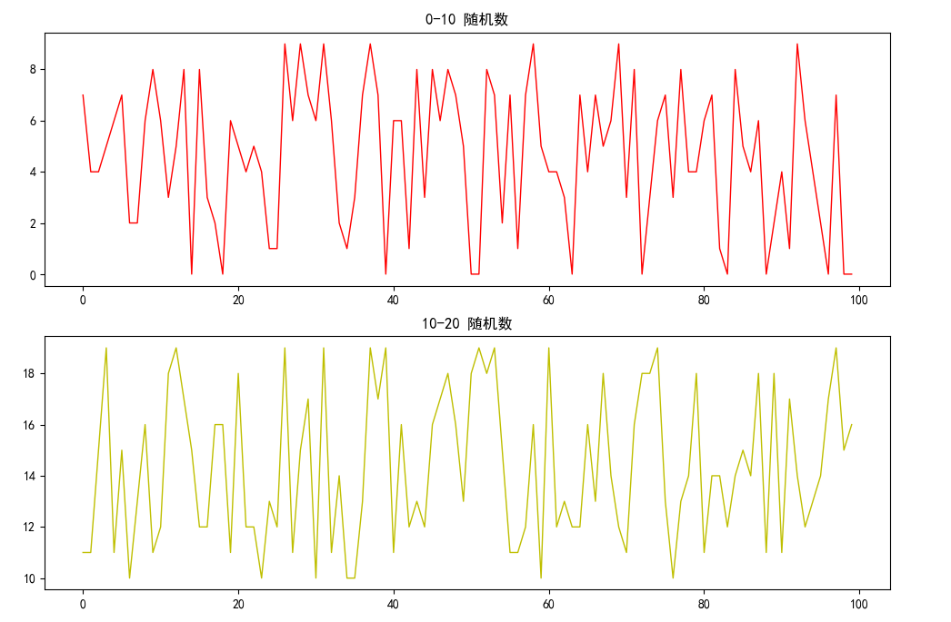
1 2 3 4 5 6 7 8 9 10 11 12 13 14 15 16 17 import matplotlib.pyplot as pltimport numpy as npplt.rcParams['font.sans-serif' ] = ['SimHei' ] plt.rcParams['axes.unicode_minus' ] = False fig = plt.figure(figsize = (12 , 8 )) ax1 = fig.add_subplot(211 ) ax2 = fig.add_subplot(212 ) ax1.plot(np.arange(100 ), np.random.randint(0 , 10 , 100 ), label = u'0-10 随机数' , ls = '-' , c ='r' , lw = 1 ) ax1.set_title(u'0-10 随机数' , fontsize = 12 ) ax1.legend(loc = 'upper right' ) ax2.plot(np.arange(100 ), np.random.randint(10 , 20 , 100 ), label = u'10-20 随机数' , ls = '-' , c ='y' , lw = 1 ) ax2.set_title(u'10-20 随机数' , fontsize = 12 ) ax2.legend(loc = 'upper right' ) plt.show()
result:
fig 4-1 subplot
add_subplot()
本质上是以坐标来定位子图位置的,左下角坐标位置时子图在整个 Figure
对象上的绝对坐标,如下
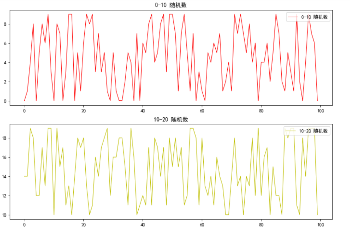
4.1.2 add_axes()
使用 add_axes() 创建子图与 add_subplot() 有所不同,add_axes()
函数中需要给定子图在整个 Figure 对象上的绝对坐标[x0, y0, width,
height],即左下角的坐标 (x0, y0) 及其宽度和高度
1 2 3 4 5 6 7 8 9 10 11 12 13 14 15 16 17 import matplotlib.pyplot as pltimport numpy as npplt.rcParams['font.sans-serif' ] = ['SimHei' ] plt.rcParams['axes.unicode_minus' ] = False fig = plt.figure(figsize = (12 , 8 )) ax1 = fig.add_axes([0.125 , 0.536818 , 0.775 , 0.343182 ]) ax2 = fig.add_axes([0.125 , 0.125 , 0.775 , 0.343182 ]) ax1.plot(np.arange(100 ), np.random.randint(0 , 10 , 100 ), label = u'0-10 随机数' , ls = '-' , c ='r' , lw = 1 ) ax1.set_title(u'0-10 随机数' , fontsize = 12 ) ax1.legend(loc = 'upper right' ) ax2.plot(np.arange(100 ), np.random.randint(10 , 20 , 100 ), label = u'10-20 随机数' , ls = '-' , c ='y' , lw = 1 ) ax2.set_title(u'10-20 随机数' , fontsize = 12 ) ax2.legend(loc = 'upper right' ) plt.show()
result:
fig 4-2 add_axes
当需要精确定位子图时,可使用
add_axes(),但获取子图精确的位置信息较繁琐
4.1.3 subplot()
add_subplot() 和 add_axes() 是对象式创建子图的方法,而 subplot()
是函数式创建子图的方法
1 2 3 4 5 6 7 8 9 10 11 12 13 import matplotlib.pyplot as pltimport numpy as npplt.rcParams['font.sans-serif' ] = ['SimHei' ] plt.rcParams['axes.unicode_minus' ] = False plt.figure(figsize = (12 , 8 )) plt.subplot(211 ) plt.plot(np.arange(100 ), np.random.randint(0 , 10 , 100 ), label = u'0-10 随机数' , ls = '-' , c ='r' , lw = 1 ) plt.legend(loc = 1 ) plt.subplot(212 ) plt.plot(np.arange(100 ), np.random.randint(10 , 20 , 100 ), label = u'10-20 随机数' , ls = '-' , c ='y' , lw = 1 ) plt.legend(loc = 1 ) plt.show()
result is same as above figure.
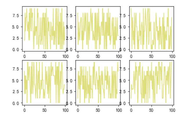
Demo: 使用 subplot 创建 2 行 3 列
排布的多子图,以遍历方式在子图上绘制折线图
1 2 3 4 5 6 7 8 9 10 11 12 13 14 import matplotlib.pyplot as pltimport numpy as npplt.rcParams['font.sans-serif' ] = ['SimHei' ] plt.rcParams['axes.unicode_minus' ] = False plt.figure(figsize = (12 , 8 )) fig_ps, axes_ps = plt.subplots(2 , 3 ) print(fig_ps, axes_ps) for i in range (2 ): for j in range (3 ): axes_ps[i, j].plot(np.arange(100 ), np.random.randint(0 , 10 , 100 ), c ='y' , alpha = 0.5 ) plt.show()
result:
fig 4-3 mul-subplot
4.2 布局多子图对象
有时不仅要在多个子图上显示图形,而且也要协调多个子图的位置和比例。三种创建子图的方法中,使用较多的是
add_plot()
方法,而该方法所创建的子图是堆成的子图,因此该方法并不满足非对称子图的应用。
若要创建非对称的子图,可以使用 matplotlib 的 GridSpec 模块。GridSpec
可以自定义子图的位置和调整子图行和列的相对高度和宽度
Import module
1 2 3 4 import matplotlib.gridspec as gridspec gridspec.GridSpec(nrows, ncols, figure = None , left = None , bottom = None , right = None , top = None , wspace = None , hspace = None , width_ratios = None , height_ratios = None )
参数 nrows 和 ncols 分别表示网格的行列数。用 plt.figure()
创建图表,通过 gridspec.GridSpec() 将整个图表划分为多个区域。由于
GridSpec 返回的实例支持切片方式选取网格区域,因此可以结合 add_subplot()
方法更灵活地添加跨度不同网格大小的子图
left, bottom, right, top 分别控制子图与 Figure
左边、底部、右边、顶部的距离比例。gs[0, : ] 表示该子图占第 0
行和所有列
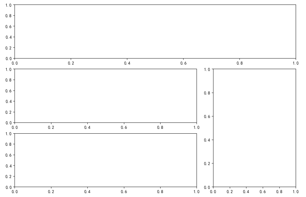
4.2.1 创建多子图布局
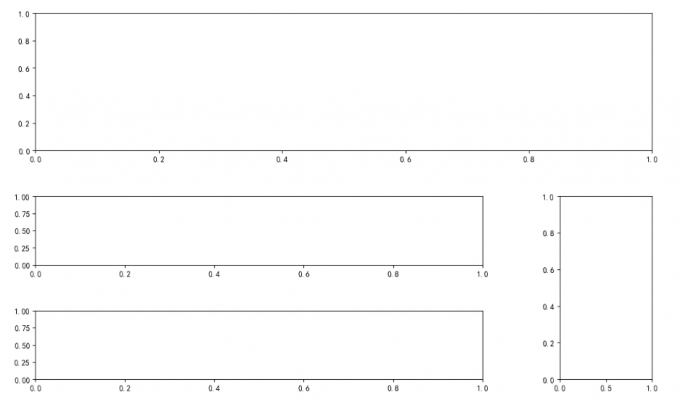
1 2 3 4 5 6 7 8 9 10 11 12 import matplotlib.pyplot as pltimport matplotlib.gridspec as gridspecplt.rcParams['font.sans-serif' ] = ['SimHei' ] plt.rcParams['axes.unicode_minus' ] = False fig = plt.figure(figsize = (12 , 8 ), dpi = 100 , facecolor = 'white' ) gs = gridspec.GridSpec(3 , 3 ) graph_ax1 = fig.add_subplot(gs[0 , :]) graph_ax2 = fig.add_subplot(gs[1 , 0 :2 ]) graph_ax3 = fig.add_subplot(gs[1 :3 , 2 ]) graph_ax4 = fig.add_subplot(gs[2 , 0 :2 ]) plt.show()
result:
fig 4-4 多子图布局图
4.2.2 微调
1 2 3 4 5 6 7 8 9 10 11 12 13 14 import matplotlib.pyplot as pltimport matplotlib.gridspec as gridspecplt.rcParams['font.sans-serif' ] = ['SimHei' ] plt.rcParams['axes.unicode_minus' ] = False fig = plt.figure(figsize = (12 , 8 ), dpi = 100 , facecolor = 'white' ) gs = gridspec.GridSpec(3 , 3 , left = 0.08 , bottom = 0.15 , right = 0.99 , top = 0.96 , wspace = 0.5 , hspace = 0.5 , width_ratios = [2 , 2 , 1 ], height_ratios = [2 , 1 , 1 ]) graph_ax1 = fig.add_subplot(gs[0 , :]) graph_ax2 = fig.add_subplot(gs[1 , 0 :2 ]) graph_ax3 = fig.add_subplot(gs[1 :3 , 2 ]) graph_ax4 = fig.add_subplot(gs[2 , 0 :2 ]) plt.show()
result:
fig 4-5 微调之后的多子图布局
5.1 plot()
Function definition:
1 2 3 4 5 plot([x], y [, fmt], data = None , **kwargs) plot([x], y [, fmt], [x2], y2 [fmt2], ..., **kwargs)
其中,[fmt]为可选参数,用一个字符串来定义图形的基本属性,包括颜色(color),点型(marker),线性(linestyle),具体如下:
tab 5-4 color properties
'b'blue
'g'green
'r'red
'c'cyan(蓝绿色)
'm'magenta(品红)
'y'yellow
'k'black
'w'white
tab 5-5 marker properties
'.'point marker
','pixel marker
'o'circle marker
'v'triangle_down marker
'^'triangle_up marker
'<'triangle_left marker
'>'triangle_right marker
'1'tri_down marker
'2'tri_up marker
'3'tri_left marker
'4'tri_right marker
's'square marker
'p'pentagon marker(五角形)
'*'star marker
'h'hexagon1 marker(六角形)
'H'hexagon2 marker
'+'plus marker
'x'x marker
'D'diamond marker
'd'thin_diamond marker
'|'vline marker
'_'hline marker
'-'solid line style
'--'dashed line style(虚线)
'-.'dash-dot line style
':'dotted line style
'b'blue markers with default shape
'ro'red circles
'g-'green solid line
'--'dashed line with default color
'k^:'black triangle_up markers connected by a
dotted line
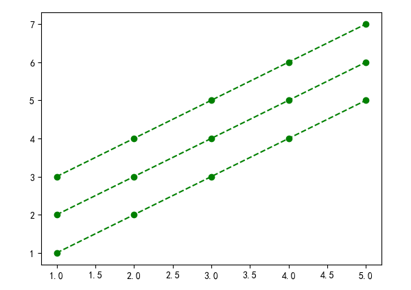
Case:
1 2 3 plt.plot([1 , 2 , 3 , 4 , 5 ], [3 , 4 , 5 , 6 , 7 ], 'go--' ) plt.plot([1 , 2 , 3 , 4 , 5 ], [2 , 3 , 4 , 5 , 6 ], color = 'green' , marker = 'o' , linestyle = 'dashed' ) plt.plot([1 , 2 , 3 , 4 , 5 ], [1 , 2 , 3 , 4 , 5 ], color = 'g' , marker = 'o' , linestyle = 'dashed' )
result:
fig 5-1 plot parameter
5.2 Abbreviation
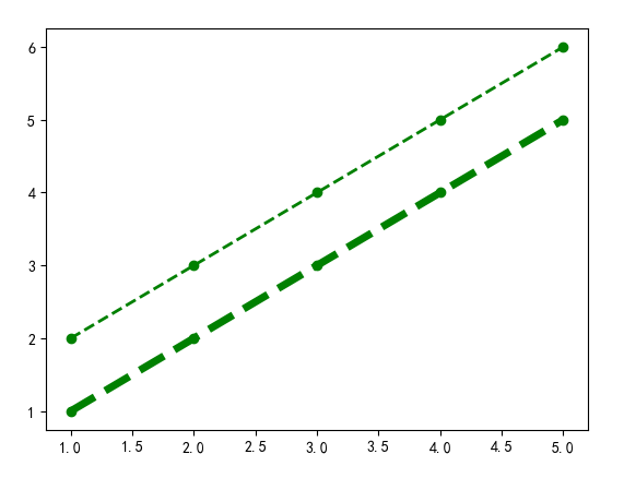
Matplotlib 支持一些属性的关键词简写:
1 2 3 4 5 6 7 8 'linewidth' : ['lw' ]'linestyle' : ['ls' ]'facecolor' : ['fc' ]'edgecolor' : ['ec' ]'markerfacecolor' : ['mfc' ]'markeredgecolor' : ['mec' ]'markeredgewidth' : ['mew' ]'markersize' : ['ms' ]
eg:
1 2 plt.plot([1 , 2 , 3 , 4 , 5 ], [2 , 3 , 4 , 5 , 6 ], color = 'green' , marker = 'o' , linestyle = 'dashed' , linewidth = 2 ) plt.plot([1 , 2 , 3 , 4 , 5 ], [1 , 2 , 3 , 4 , 5 ], c = 'g' , marker = 'o' , linestyle = 'dashed' , lw = 5 )
result:
fig 5-2 Abbreviation
5.3 Ticks
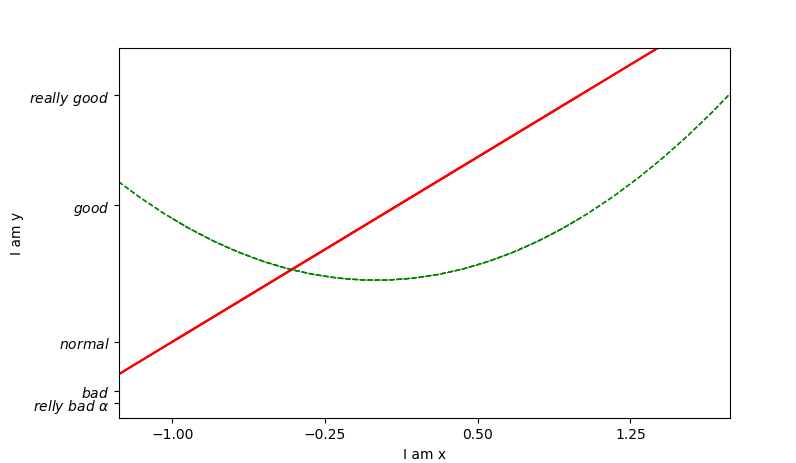
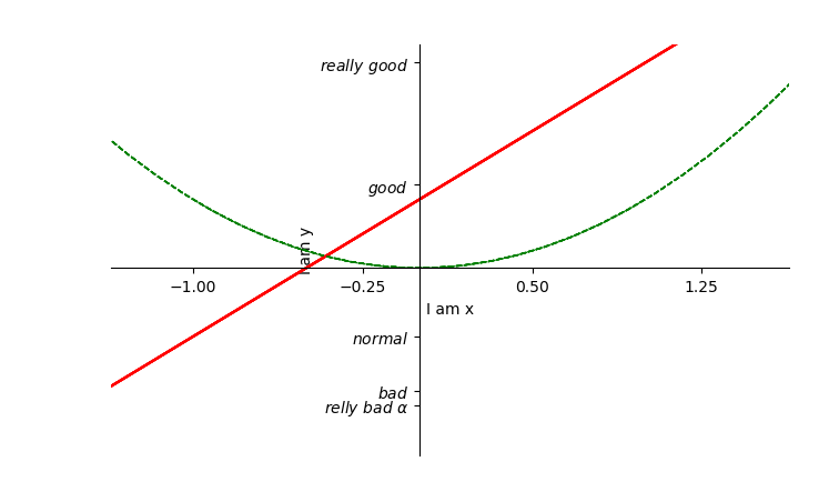
1 2 3 4 5 6 7 8 9 10 11 12 13 14 15 16 17 18 19 20 21 22 23 import matplotlib.pyplot as pltimport numpy as npx = np.linspace(-1 , 1 , 50 ) y1 = 2 * x + 1 y2 = x**2 plt.figure(num = 1 ) plt.plot(x, y1, color = 'red' ) plt.plot(x, y2, color = 'green' , linewidth = 1.0 , linestyle = '--' ) plt.xlim((-1 , 2 )) plt.ylim((-2 , 3 )) plt.xlabel('I am x' ) plt.ylabel('I am y' ) new_ticks = np.linspace(-1 , 2 , 5 ) print(new_ticks) plt.xticks(new_ticks) plt.yticks([-2 , -1.8 , -1 , 1.22 , 3 ], [r'$relly\ bad\ \alpha$' , r'$bad$' , r'$normal$' , r'$good$' , r'$really\ good$' ]) plt.show()
result:
fig 5-3 Ticks demo
5.4 Axis position
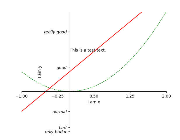
1 2 3 4 5 6 7 8 9 10 11 12 13 14 15 16 17 18 19 20 21 22 23 24 25 26 27 28 29 30 31 32 import matplotlib.pyplot as pltimport numpy as npx = np.linspace(-3 , 3 , 50 ) y1 = 2 * x + 1 y2 = x**2 plt.figure(num = 1 ) plt.plot(x, y1, color = 'red' ) plt.plot(x, y2, color = 'green' , linewidth = 1.0 , linestyle = '--' ) plt.xlim((-1 , 2 )) plt.ylim((-2 , 4 )) plt.xlabel('I am x' ) plt.ylabel('I am y' ) new_ticks = np.linspace(-1 , 2 , 5 ) print(new_ticks) plt.xticks(new_ticks) plt.yticks([-2 , -1.8 , -1 , 1.22 , 3 ], [r'$relly\ bad\ \alpha$' , r'$bad$' , r'$normal$' , r'$good$' , r'$really\ good$' ]) ax = plt.gca() ax.spines['right' ].set_color('none' ) ax.spines['top' ].set_color('none' ) ax.xaxis.set_ticks_position('bottom' ) ax.yaxis.set_ticks_position('left' ) ax.spines['bottom' ].set_position(('data' , 0 )) ax.spines['left' ].set_position(('data' , 0 )) plt.show()
result:
fig 5-4 Modify axis position
5.5 legend()
'best'
0
'upper right'
1
'upper left'
2
'lower left'
3
'lower right'
4
'right'
5
'center left'
6
'center right'
7
'lower center'
8
'upper center'
9
'center'
10
5.6 Add text
1 ax.text(0 , 2 , 'This is a test text.' )
fig 5-5 Add text on figure